Malton Vineyard
Label Design
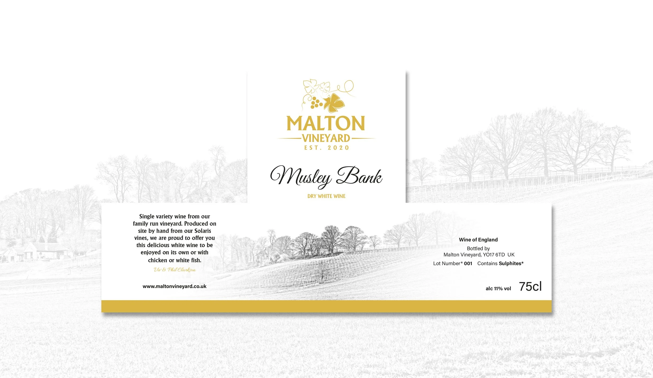
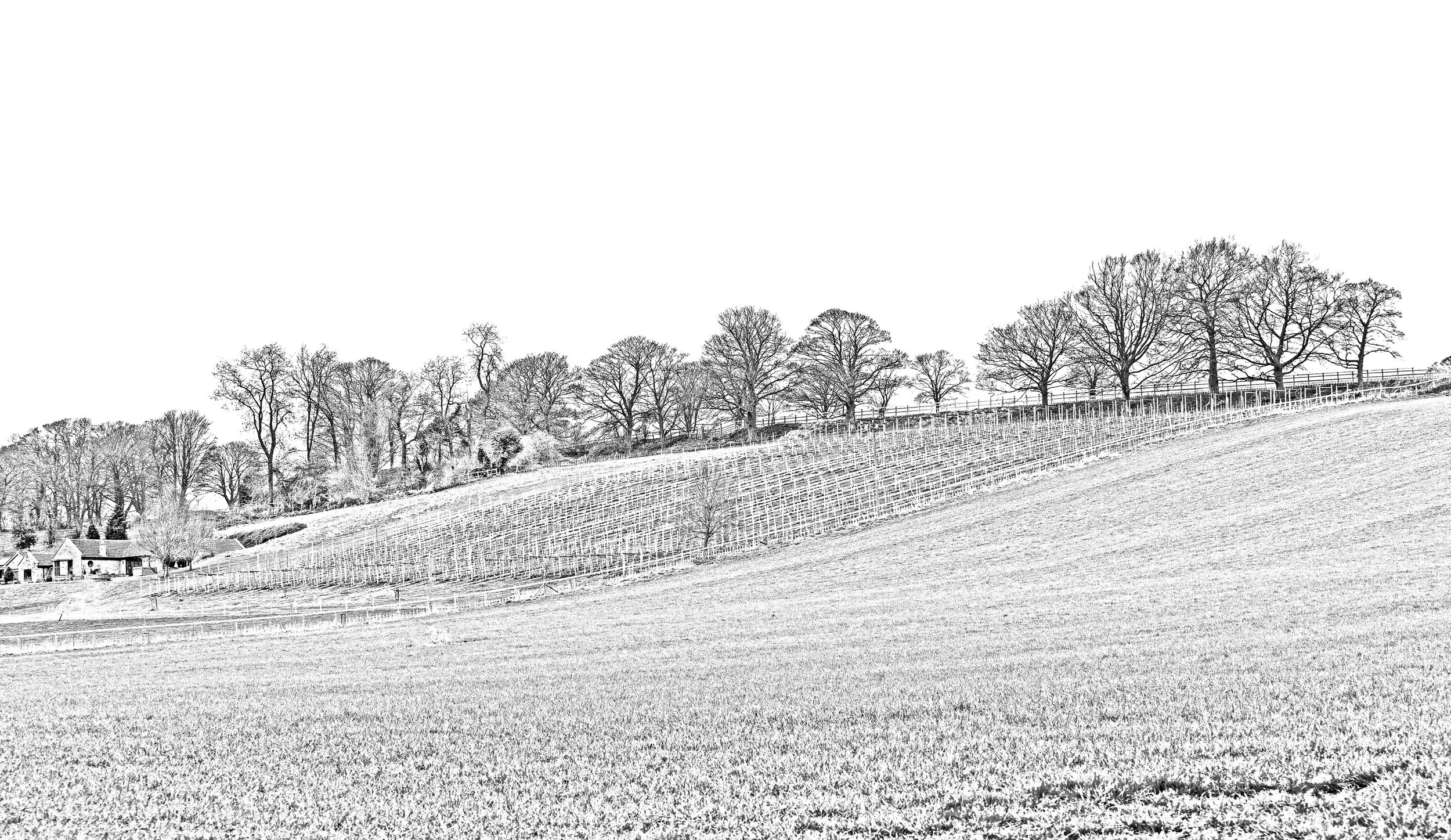
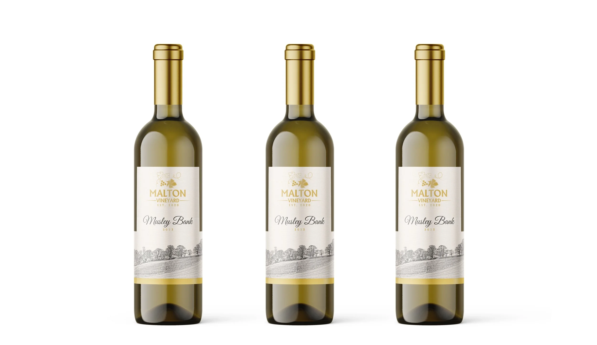
For Malton Vineyard, I created a range of wine and cider labels that were designed to tell the story of the vineyard, its land and the people behind it. The wine label takes inspiration directly from Musley Bank, the hillside where the vines are grown. I photographed the landscape and transformed the image into a hand-drawn style sketch in Photoshop, creating a distinctive illustration that connects the bottle directly to its Yorkshire roots. The folded wings of the label were then used to tell the story of the wine and provide all the relevant information without taking away from the main design.
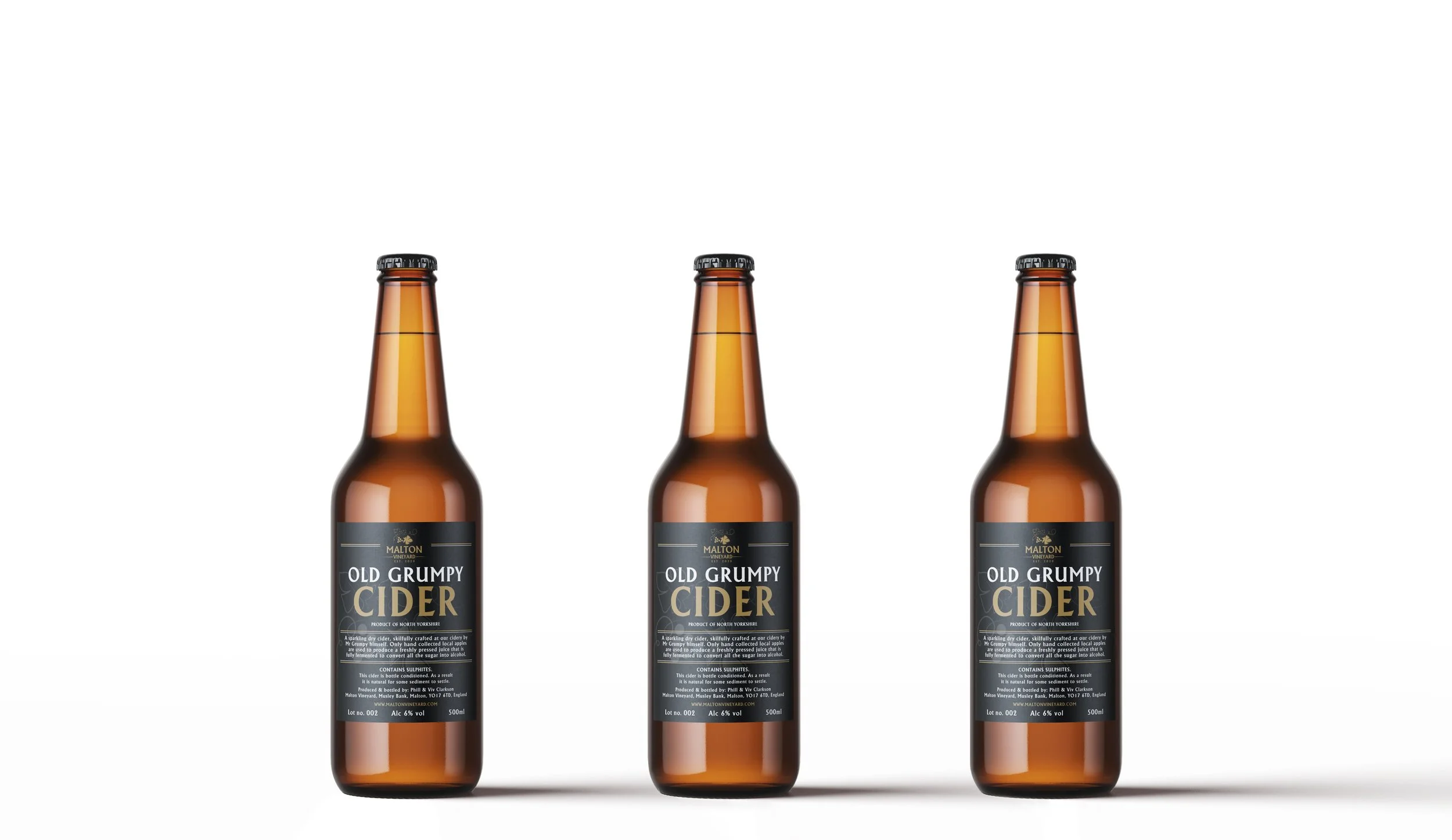
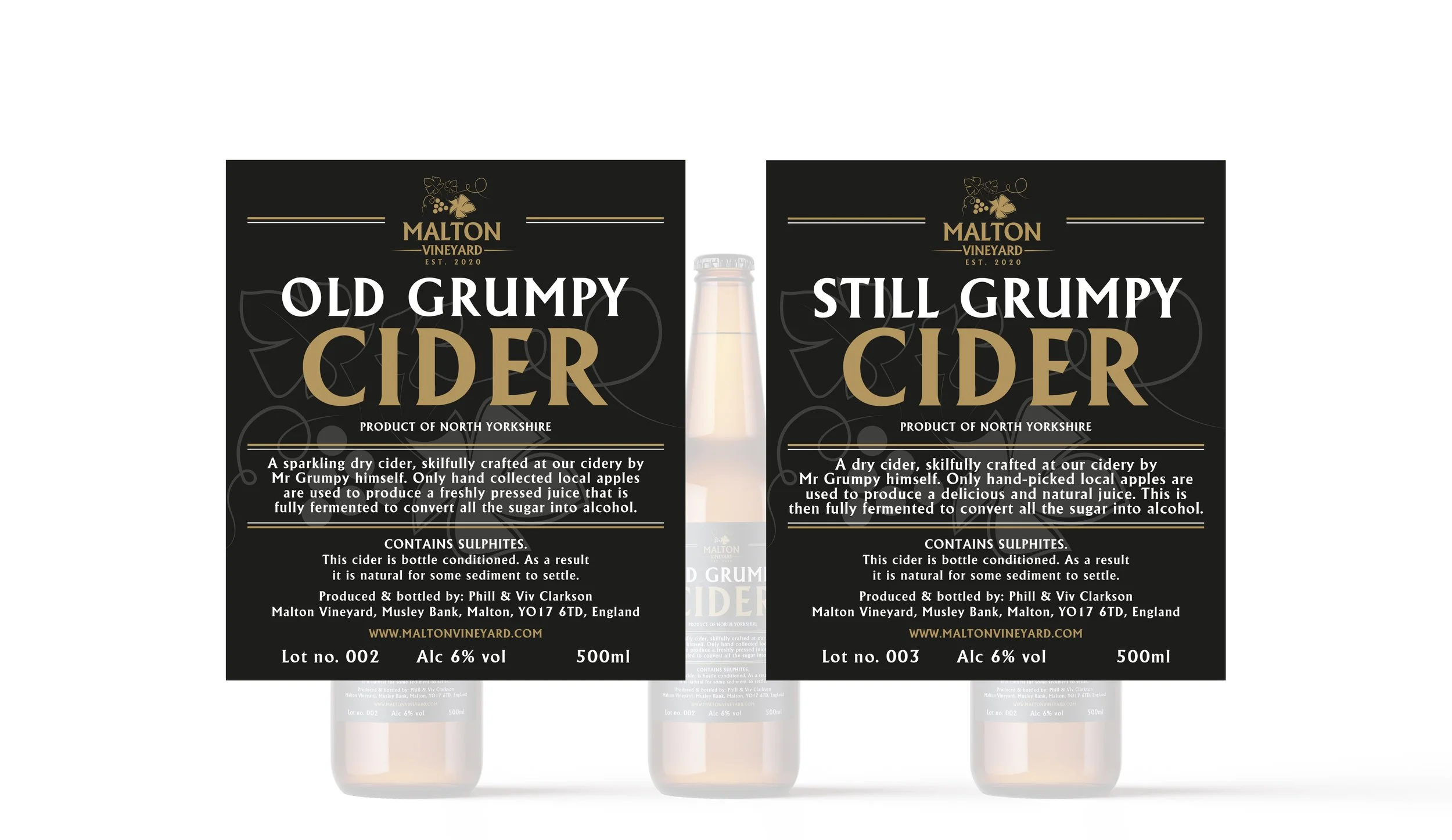
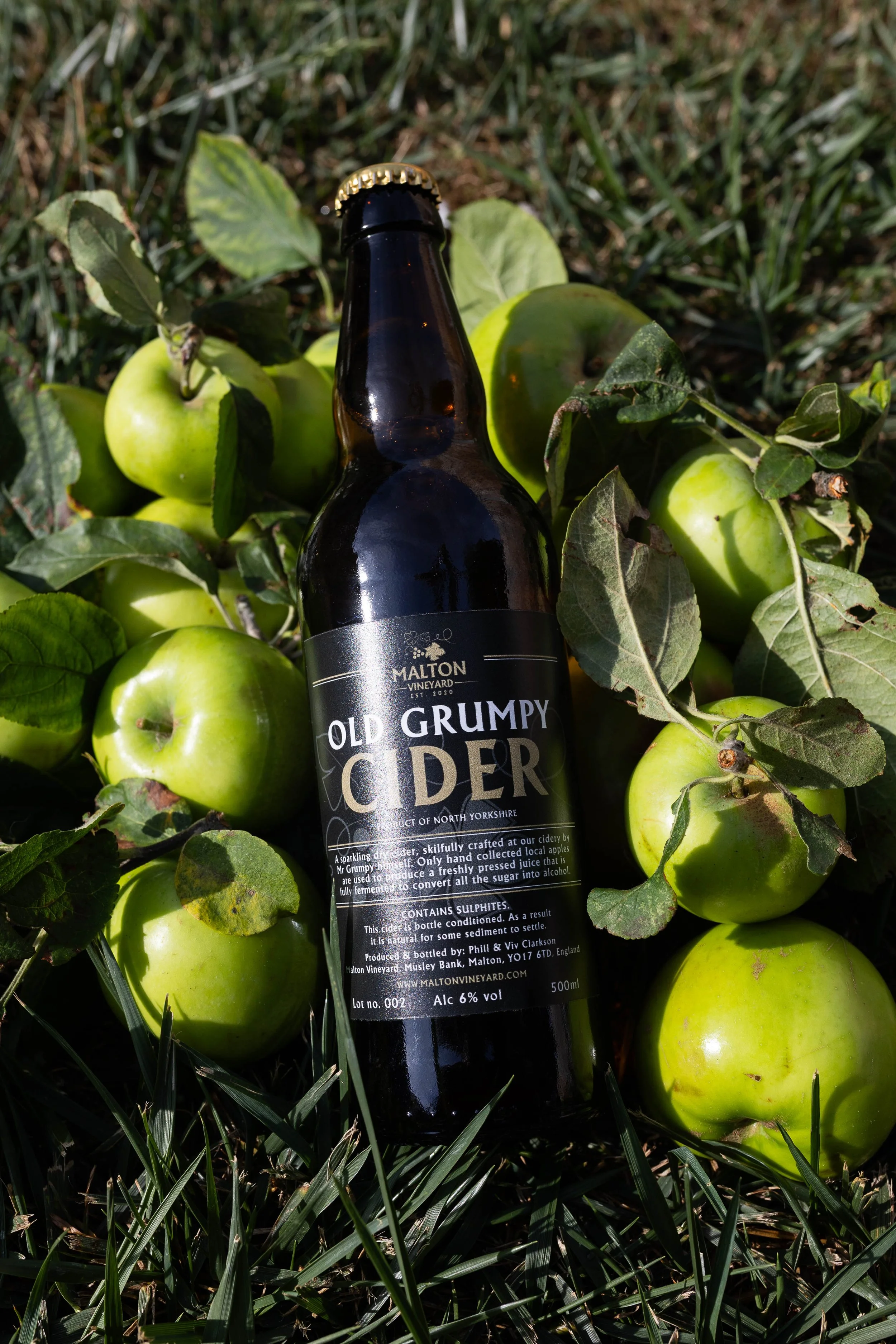
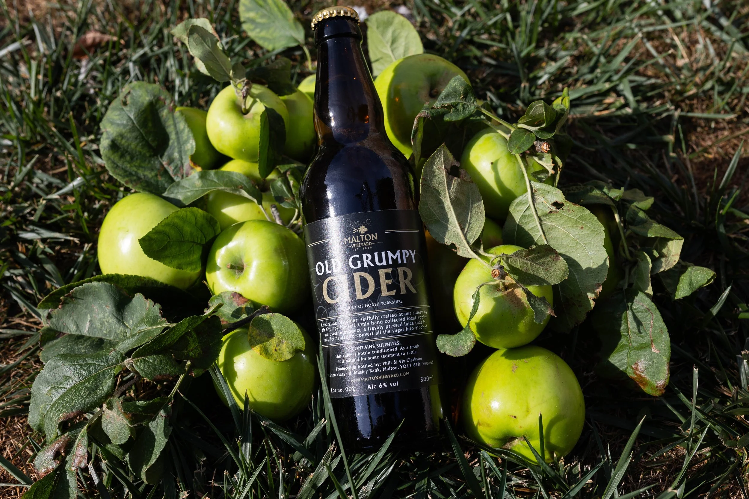
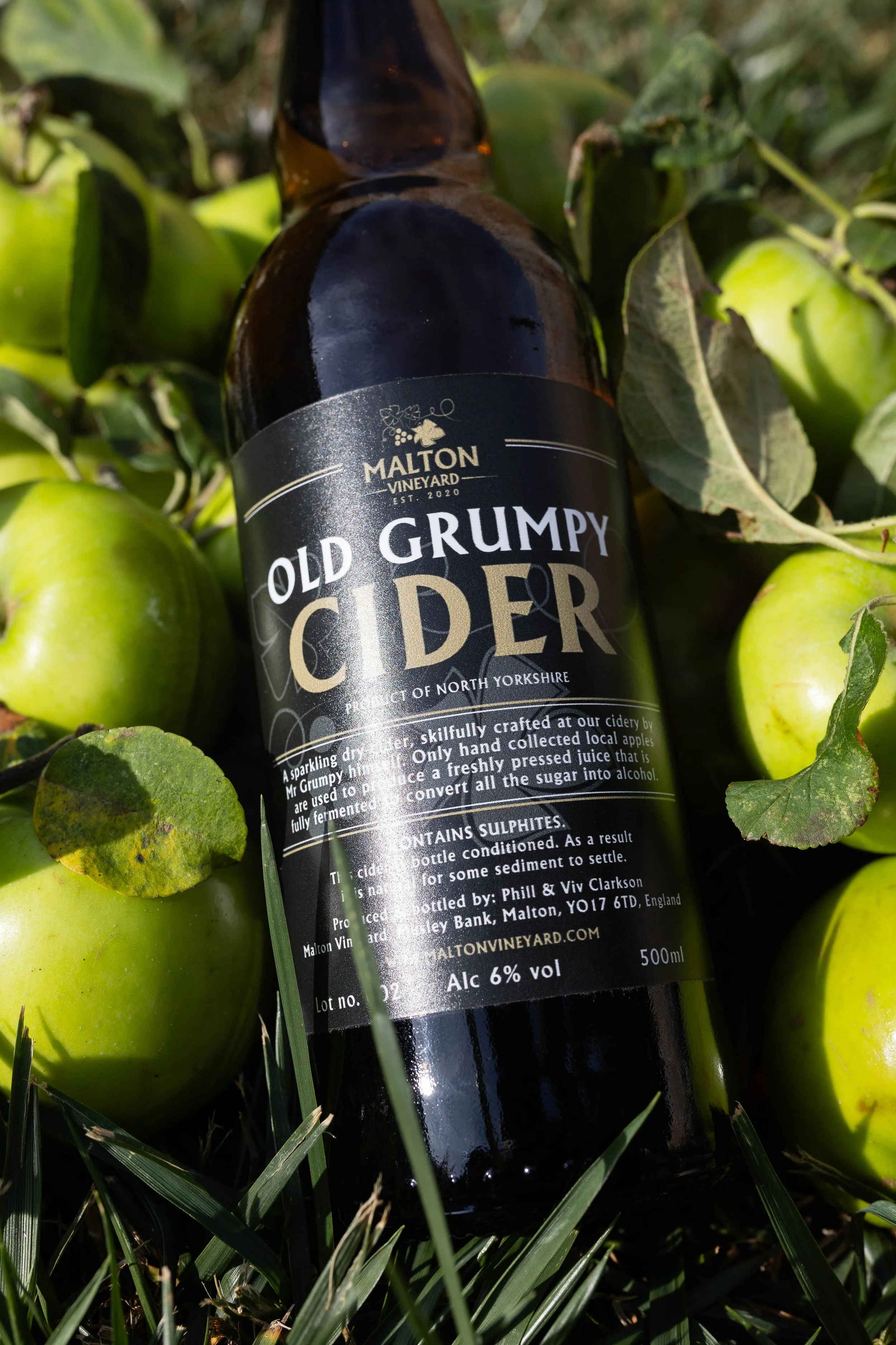
For the cider range, we took a completely different and more tongue-in-cheek approach. The labels were inspired by Pete, the man behind the wine and cider production at Malton Vineyard, with the concept playing on the old Yorkshire character of a “Grumpy Man Pete”. The result is a fun, personality-led label design that gives the cider its own character while celebrating the people behind the product.